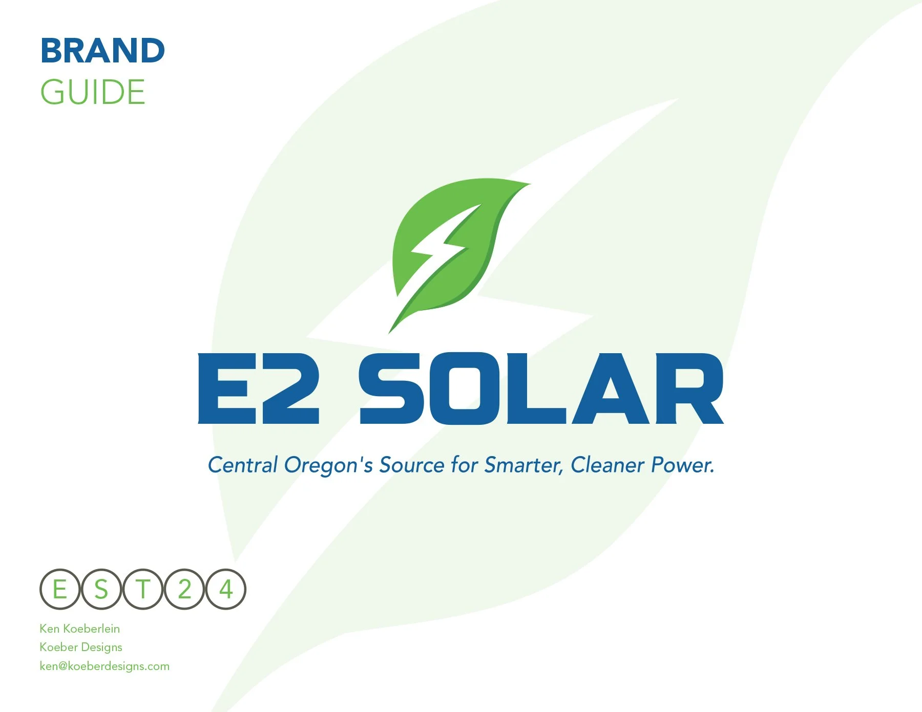

Bend, Oregon
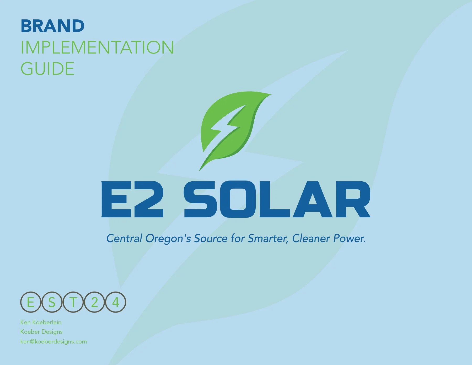
E2 Solar
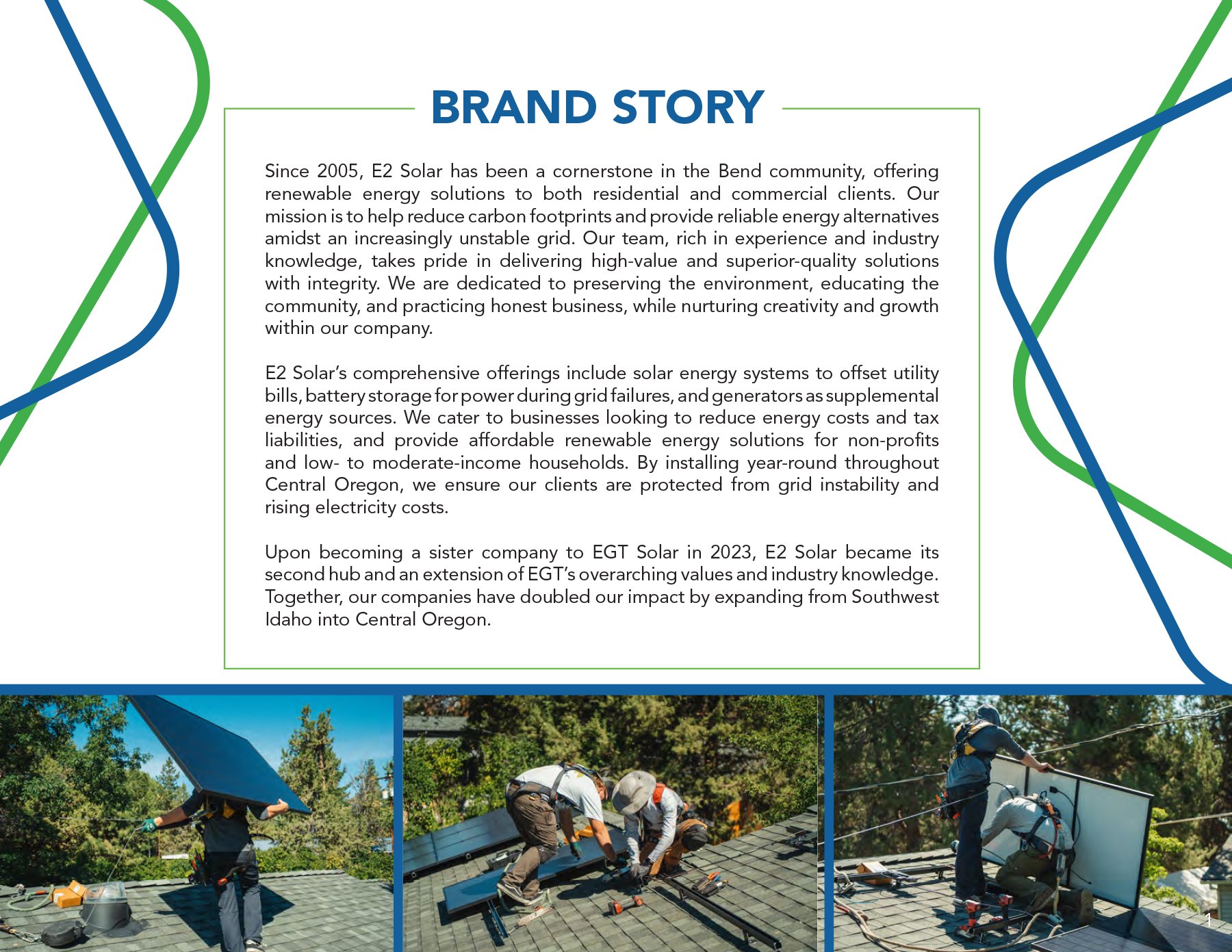
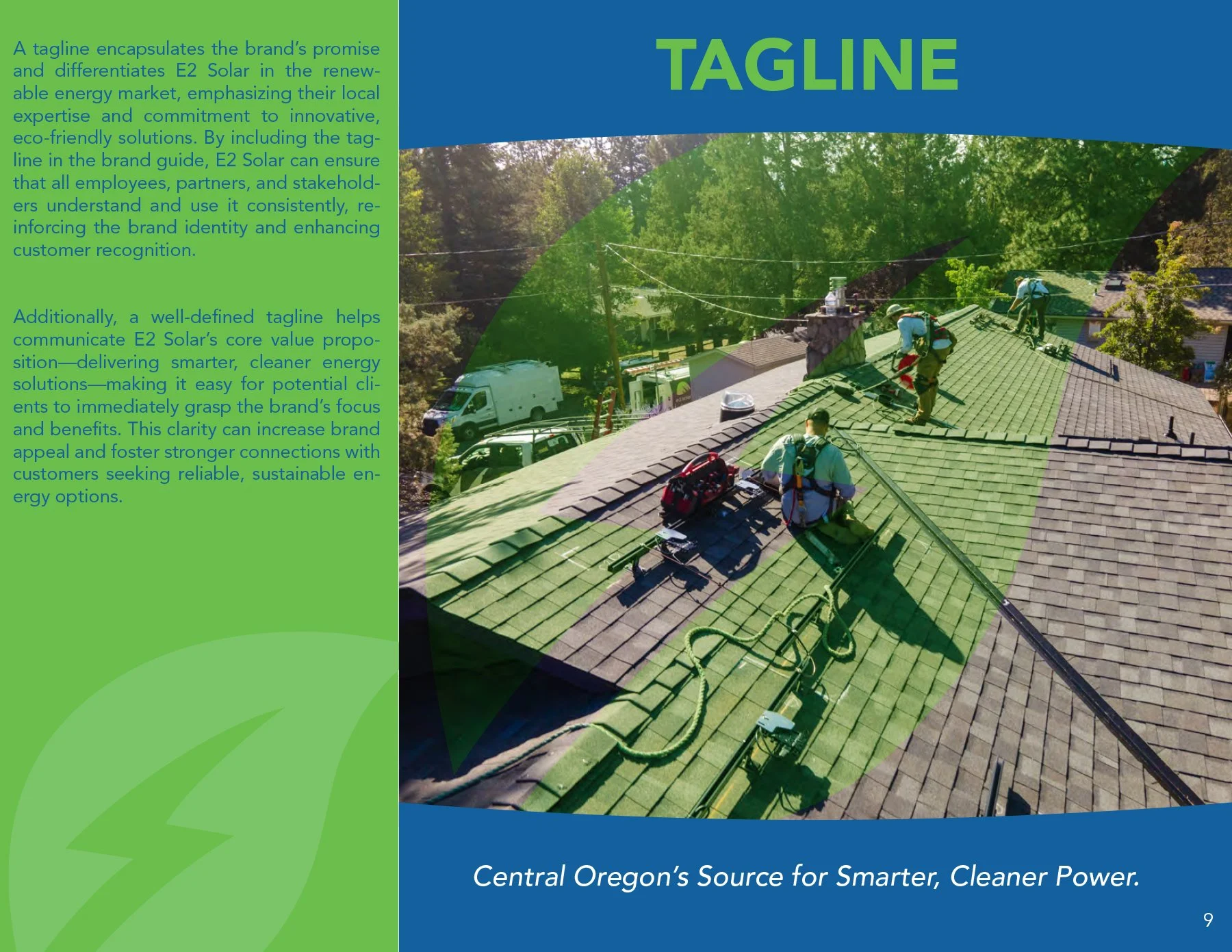
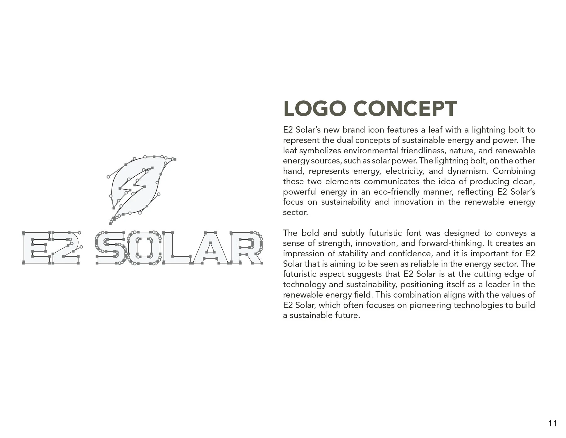
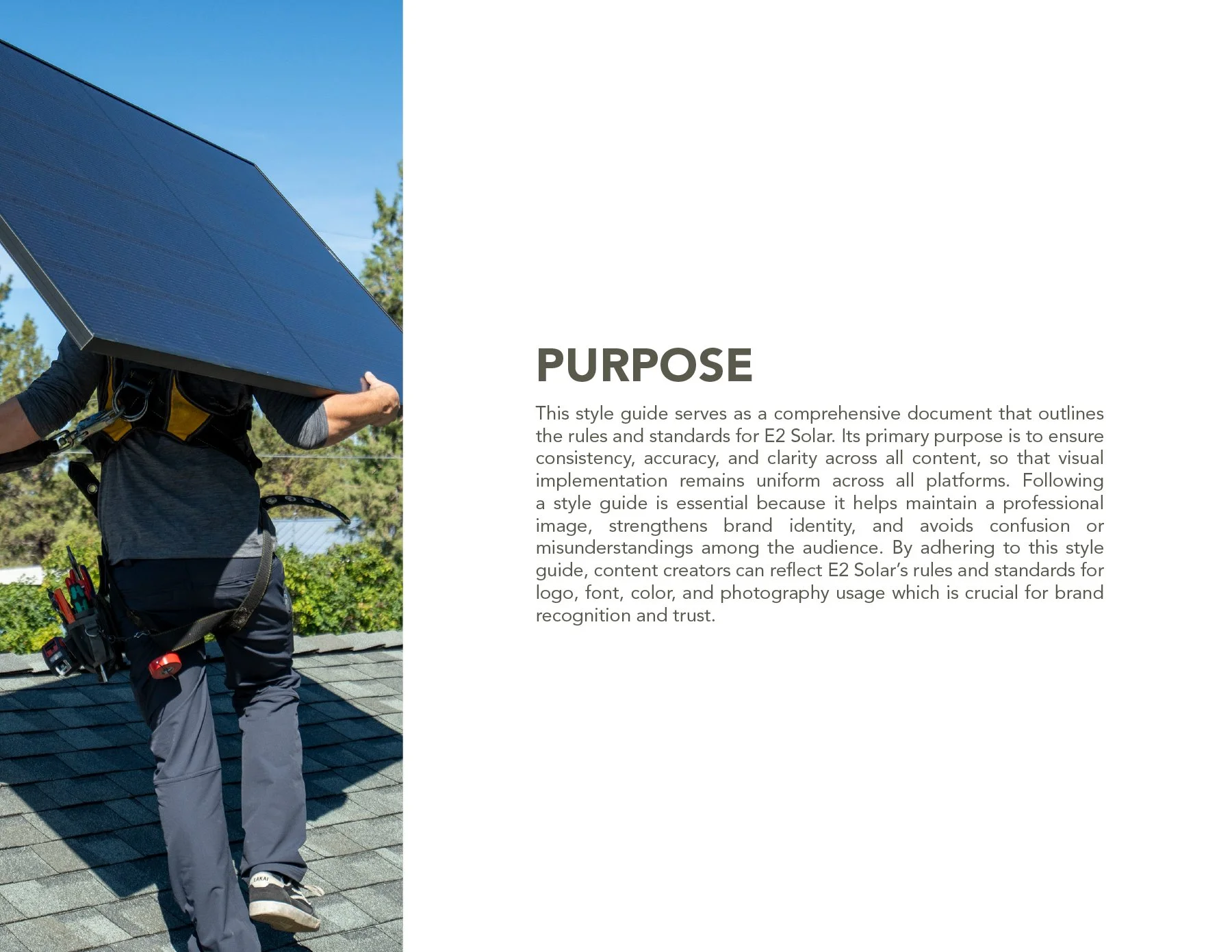
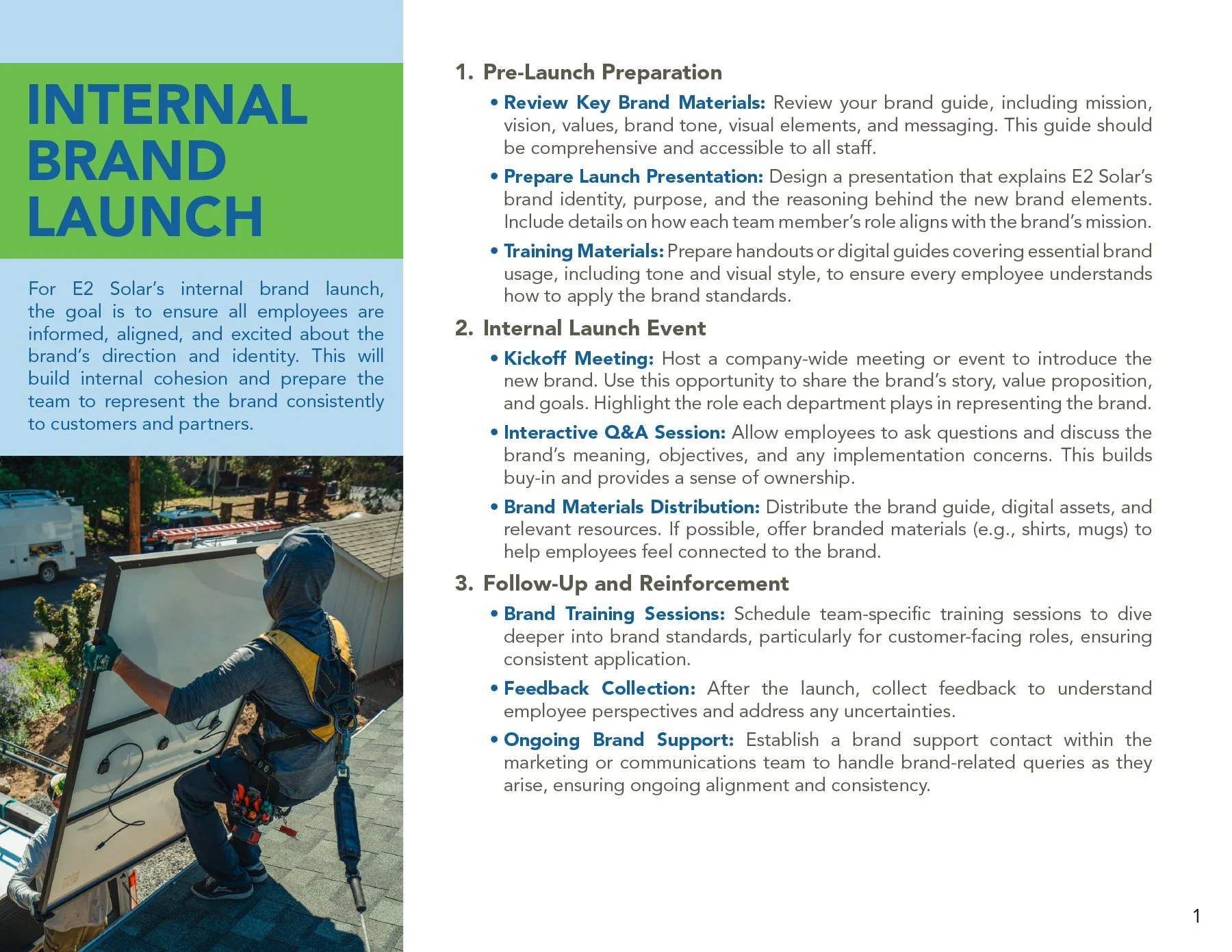
Recharging a Brand Built on Sunlight
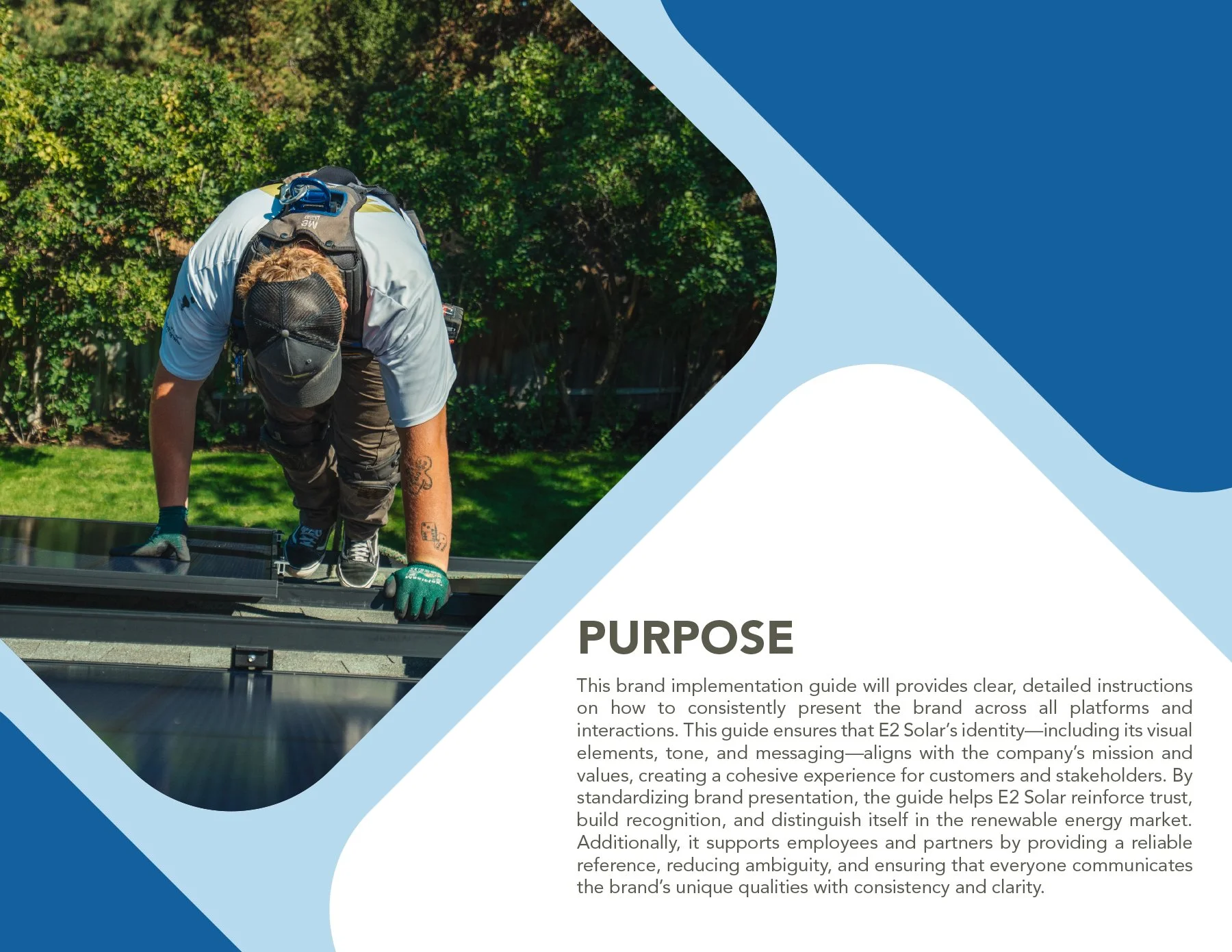
When E2 Solar approached me, they had an incredible track record in solar energy but a brand identity stuck in the shade. Their visuals felt dated, their messaging lacked cohesion, and their core values weren’t being reflected in how they showed up online or off. Potential clients couldn’t clearly see what set them apart and in a rapidly growing industry like solar, that kind of misalignment meant lost opportunities.
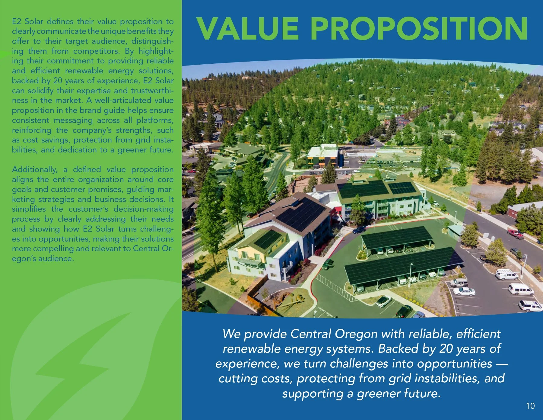
Through a full brand discovery and strategy session, I helped E2 Solar reconnect with what made them powerful: a commitment to quality craftsmanship, community-rooted values, and sustainable innovation. We distilled their essence into a clean, confident logo, crafted a tone that matched their approachable expertise, and built a brand story that speaks to both homeowners and commercial partners alike.
The result? A modern, consistent brand that reflects their mission and builds trust from the very first impression. Now, when people encounter E2 Solar, they don’t just see a solar company, they see a reliable partner helping them take control of their energy future.
Old Logo

New Logo

Old Logo vs. New Logo: Why the Redesign Wins
-
Old: The abstract sun graphic in place of the “O” was vague and difficult to interpret at a glance.
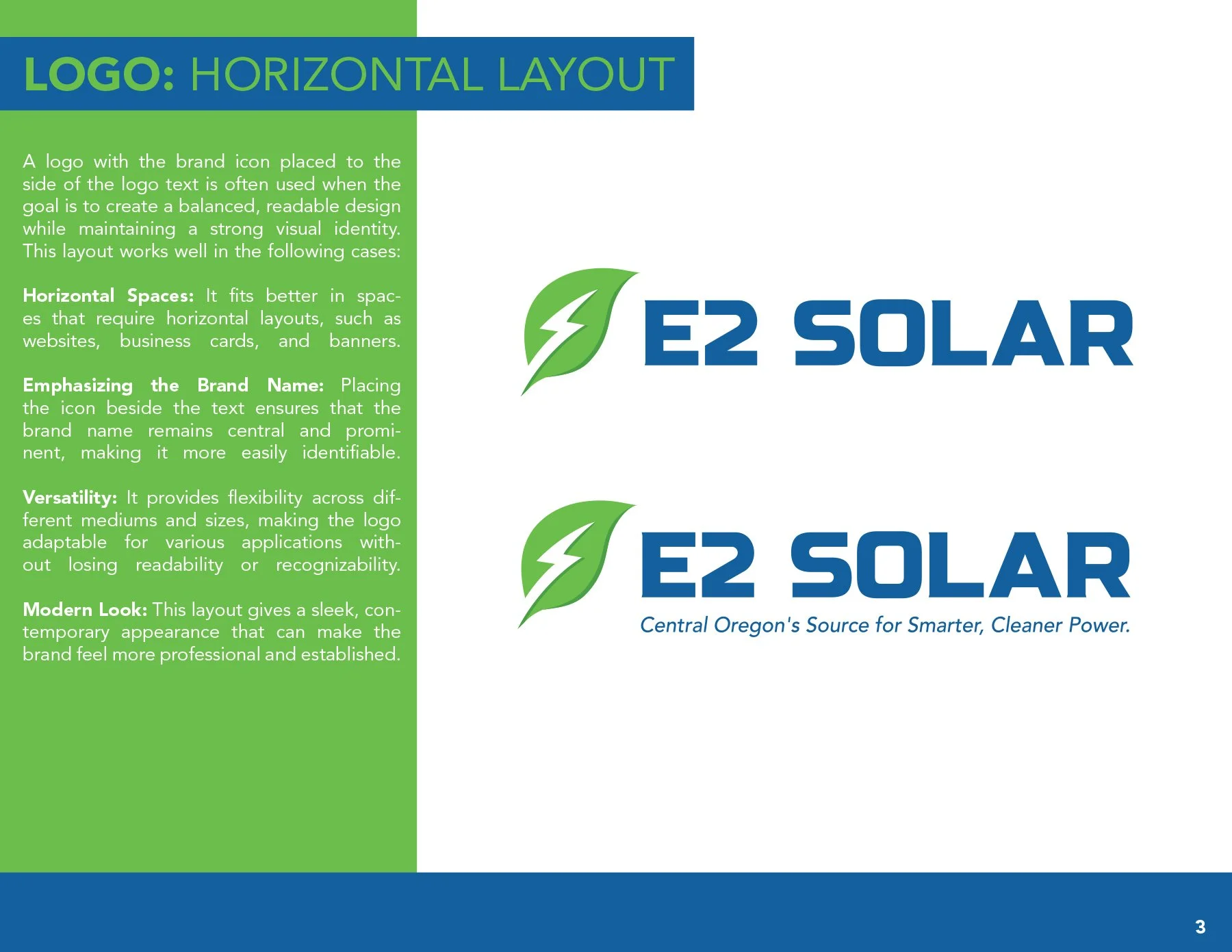
New: The leaf-and-bolt icon instantly communicates clean, renewable energy, making it both relevant and recognizable. Description text goes here
-
Old: Thin serif typography felt outdated and lacked the strength or precision expected from a solar energy company.
New: Bold, modern sans-serif lettering gives the brand a confident, trustworthy, and tech-forward presence.
-
Old: Contained no supporting tagline or clear indication of geographic focus or service promise.
New: Includes a tagline “Central Oregon’s Source for Smarter, Cleaner Power”, which reinforces both regional authority and brand values.
-
Old: Limited contrast and less vibrancy, giving the logo a muted appearance.
New: Uses vibrant green and blue to evoke sustainability, energy, and trust, while enhancing visual impact across digital and print.
-
Old: Only offered a horizontal lockup, making it difficult to apply across different media formats.
New: Includes both horizontal and vertical lockups, improving flexibility across web, print, signage, uniforms, and promotional materials.
-
Old: Thin lines and serif details could degrade at small sizes or in embroidery.
New: Simplified, bold design scales cleanly at any size and is more production-friendly.